
A new lens on performance: YakTrak’s smarter reporting has arrived

What if you could see the impact of coaching before the results come in? Or even predict what’s likely to happen next?
For many contact centre leaders, data visibility is an ongoing challenge. Dashboards show today’s numbers. Spreadsheets show yesterday’s activity. And trend analysis? That often requires an analyst, a ticket, and a few days' wait.
Most reporting tools are like a photo—you get a static snapshot. YakTrak’s new reporting is more like a live stream. You don’t just see what happened. You see how it’s changing. And, crucially, what’s likely to happen next.
YakTrak’s new reporting feature makes that shift real.
Whether you’re a Team Leader tracking coaching activity, a GM looking at behavioural adoption, or an L&D leader embedding change, our new reporting functionality offers a faster, clearer lens on what’s working, what’s changing, and what’s next.
Why we built it
Leaders told us they needed more than moment-in-time data. They needed to track activity, see behavioural progress, and make decisions faster. But until now, YakTrak’s reporting required users to manually run reports, lacked trend views, and made comparisons difficult across cadences and cohorts.
In the background, many of our clients were already doing this work manually creating bespoke reports to show trends over time. Our goal was to bring all of that into the product itself: smarter reports, built once, that update live.
What’s new
YakTrak’s reporting now includes a live dashboard where users can:
Build reports once and set them to auto-refresh with live data
Visualise trends over time (weekly, monthly, quarterly, or custom)
Compare behaviour or rhythm data across teams, individuals, and activities
Customise report visuals (e.g. line, column, heat map, or table)
Drill into team or activity performance by cadence (weekly, fortnightly, monthly)
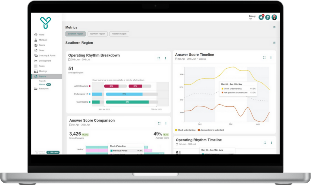
There are currently six reports available to all users, with more on the way:


Answer score comparison: Compare behavioural scores (QA, coaching, assessments) from one period to another. For example, see whether the behaviour ‘set expectations clearly’—measured through QA or coaching assessments—has improved across your service team compared to last month.
Answer score timeline: Track how specific behaviours are trending week by week or month by month. For instance, monitor whether ‘check for understanding’ is steadily improving as recent coaching efforts take hold.
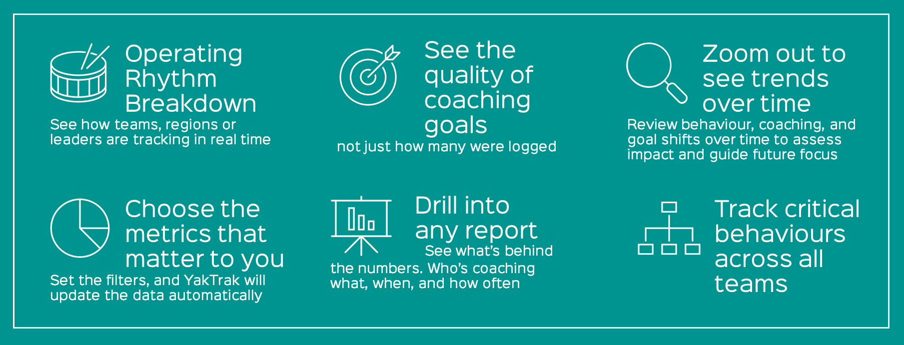
Goal completion: See how many goals are being created and completed across time. Spot dips in momentum after busy periods, or spikes following capability sprints.
Operating rhythm breakdown: Visualise how consistently team leaders are delivering expected routines—like one-on-ones, QA sessions, or coaching—at their assigned cadence.
Operating rhythm timeline: Monitor how coaching rhythms shift over time. This helps leaders detect gradual declines before they impact engagement, performance, or compliance.
Activity trends: Track volume shifts across key activities—like QA reviews, coaching sessions, or goal setting—to understand when and where engagement is rising or falling.
How it works

It’s a simple setup:
Choose your subject (individuals, teams, or both)
Select the relevant routines or activities (e.g. coaching, QA, one-on-ones)
Define your cadence (weekly, fortnightly, monthly)
Pick your date range (last 30 days, 90 days, this quarter, etc.)
Choose how you want it visualised
Once created, your dashboard is live. Every time you refresh, you see up-to-date data with no extra clicks.
“Different teams have different rhythms—this dashboard respects that. One view, multiple realities.”
Leaders can save multiple versions of the same report type—for example, separating QA trends for outbound teams vs service teams. And users can toggle views, turn on heat maps, or switch between charts and tables depending on how they like to work.
What it unlocks
From day one, this new feature delivers time savings and sharper insights. But the bigger value is strategic—and predictive.
For GMs:
• No need to request reports from analysts or admins
• Quickly pinpoint where coaching has dropped off or behaviour has improved
• Track whether your people are doing what’s expected—before results dip
• Forecast performance risk based on changes in rhythm or goal themes
For QA or L&D:
• Identify which behaviours are improving, declining, or flatlining
• Spot trends across teams and align learning interventions accordingly
• Predict whether behaviour gaps could impact CSAT, NPS, or FCR
• Run targeted sprints or campaigns to lift specific behaviours before KPIs are affected
For Team Leaders:
• Understand how your team is tracking on specific behaviours
• Show progress in coaching conversations with visual evidence
• Adjust your coaching focus based on what’s trending—and what’s likely to follow

Example in action:
A GM noticed FCR was falling below target. Using the answer score timeline, they identified a likely cause: two key behaviours that typically support strong FCR—"set expectations clearly" and "check for understanding"—had declined across multiple teams. They launched a focused coaching sprint to rebuild those habits. Within weeks, both behaviours lifted—and FCR returned to target. Instead of reacting to lagging results, the GM used behavioural insight to course-correct in real time.
From insight to foresight
YakTrak’s reporting feature does more than display data. It enables early detection and informed action. When coaching cadence drops below 50%, or when goals shift away from customer outcomes, leaders can now anticipate the impact—before it happens.
This is data-driven decision making for human capability. It means teams can redirect focus, recover quickly, and hit goals more consistently.
A foundation for smarter pathways
This isn’t just a better way to report. It’s the foundation for YakTrak’s future.
As AI features evolve, this reporting capability will support new layers of insight—from coaching quality analysis to AI-led report generation. In future releases, you’ll be able to describe the data you want (“show me coaching trends for my sales teams last quarter”), and YakTrak will build the report for you.
These insights will also feed into personalised learning journeys. If we see that a team is underperforming in “set expectations,” for example, we can trigger the right learning modules, goals, and coaching prompts automatically.
Your data, your lens
Whether you’re embedding a new program, driving coaching quality, or rolling out change, YakTrak’s new reporting makes it easier to see where progress is happening—and where it’s not.
You no longer need to wait for results to see impact. With YakTrak, it’s already on your dashboard.
Want to see how it works in your environment? Book a walk through today.